Well class is now finished and I have to say even though I think I did a great job, some of my classmates have done an excellent job. I'm wondering if my work will ever be good enough or creative enough. Some people's work already look like advertisements. My stuff looks artistic but I feel like it is far from professional. Maybe I am being hard on myself.
I took my exam today. I practically memorized most of the terms so I better get an A! Maybe I will be able to use the terms in the future. Terms like Kerning: adjusting the space between two letters. And you can do this in Illustrator.
Next semester, I am taking Computer Graphics 2 and Web Design. So that will be a real challenge at 8:30 in the morning!!! I am so not excited about that because I have to make a 45 minute drive to the school. So I may just roll out of bed and go. lol It usually takes me an hour to get ready but it is hard to go to bed early when you are not sleepy....
But it is making me think, will I ever make it as a Graphic Designer because there is so much hard competition out there...
The last project of the semester!!! Yay! But I have learned so much! This last one was using words to create an image. I decided to use the song by Seal "Kiss from a Rose" I love that song. But this was a challenging project. I used Illustrator to trace the picture that I used:
 |
| I was inspired by this photo. |
I chose 4 or 5 different fonts and I used the pen tool to trace the rose and then the text tool. I had to use Illustrator because Photoshop was pissing me off on my own computer! My text tool would not write on the curvy lines! So I said eff it! I am going to do this in Illustrator.
So after I traced the whole rose I had to figure out what I was going to do next. At first I wanted the background to be white and keep all the original colors. But then I saw this picture:
And I was like, that would be so nice. I bet the background would look better black. But I want to keep the color of the rose. To accomplish that, I had to copy all of my words and paste the into Photoshop. Then I had to copy a new picture layer and make it the top layer and turn down the opacity. Then I hit command> j > and click to create a mask. And now the words are the same color as the picture. Then I make the background black and then this is what happened!
* * * * * *
* * *
* *
This one was fun and challenging. I had to used Adobe Illustrator to create a font. And then your font has to represent a company. We talk about our company in a Creative Brief.
Grade: 96%
Out of all the thumbnails I chose this one:
To me, my company looked like a very chic pastry café.
Grade: 96%
Out of all the thumbnails I chose this one:
Most of these letters were created from shapes and using the shape tools and the pen tool. After the letters were created I had to join the shapes together that created each letter. And you join the shapes by going to Object > Expand. Then using the Shapebuilding Tool, I highlight the lines and the lines will turn red. I joined the lines together so that when you hover over the letter again it should be one whole shape. And you will be able to fill it with any color you like.
To me, my company looked like a very chic pastry café.
I learned a lot about letter relationships. And how the stem of a b can come from an H. And the letter r came from m.
Adobe Illustrator CS6 became one of my favorite programs to use. I actually found it easier than Photoshop.
This project was fun. We had to take some phrases and add some character to them. Some letters were created from scratch. Like Off Key. And some I just used a font and altered it.
Grade: 81%
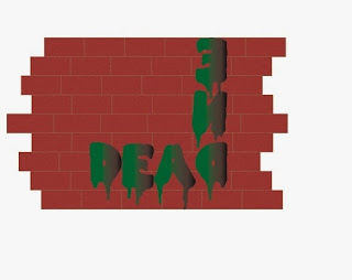
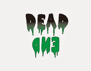
Dead End was so hard for me. I tried to do something with a dead end street.
then I thought adding a wall would be cool.
But I liked the drippy letters so I brought those back instead of graffiti letters. The only reason why I added the wall is so there wouldn't be any empty space from having the letters shaped like an L. But then it was like the wall took away from the letters and it was about the font.

 So I settled on this.
Kerning:
This class was pretty fun and easy. I enjoyed it. The only part I hated was presenting. I would always get nervous and forget what I wanted to say. It was frustrating. But this class was all about doing creative stuff with type. And type can set a certain mood or express something. It was an interesting class.
One of our projects was to demonstrate Kerning by finding a font that would fit the name of a city.
Now what is Kerning? Kerning is just adjusting the space between letters.
The Project: We were given a few city names and we had to pick a font that described that city. It was up to us. However you interpret it. And you have to research each city of course. All of my fonts were done in Adobe Illustrator CS6.
Grade: 95%
This is the one I chose for class. I said that the C was lowercase to represent my diminutive stature and it kind of looks like a font I would write in. And sometimes I really do dot my I's with a heart.
Ahhh. This class had to be the most expensive and most challenging course. If you didn't already own an old manual camera that was going to cost you. This semester we had to develop our own pictures. Even though it was quite time consuming, some parts of it were therapeutic and I had a chance to listen to my entire list of songs on my Ipod! You must buy developing film, photopaper and whole lot of other supplies.
1. I had to learn how to put film on a film reel IN THE DARK! Ha! Let's see you do that! And I could do it in 5 minutes!
2. Make sure when you are developing your film that you use the chemicals in the right order and the right amount of time. I made this mistake early on.
3. After the roll is developed and dry, now you have to print. The old-fashioned way!
You need filters and the right amount of light. An f-stop determines the right amount of light. You turn the knob to the appropriate f-stop (f8 being the brightest and f16 being the dimmest). It is trial and error with this step so I had to make sure I had plenty of scrap test strips on hand.
4. Develop the paper in the chemicals. It takes a total of 15 minutes for each photo to develop if you do it perfectly.
5. Drying time!
The ball is demonstrating Arrested Motion.
These boots were for Texture project.
I had to work with the teacher to fix it during the printing process and play with different filters.
These glasses were for Selective Focus which was a class favorite project.
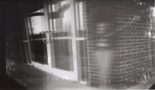
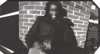
 The lovely pinhole pics. That is me standing in front of the building. It took 10 minutes to snap this and that was because it was so cloudy. Pinhole cameras take a lot of patience.
For the final project we had to create a line book from scratch.
A line book is just a really long accordion book of all the definitions of lines and also an illustration of these lines. Types of lines like: Cross-hatching, contouring, and scribbling.
For my theme I chose autumn. And then we were given directions on how to bind a book. It was simple. Just take some hard cardboard (not the box kind) and whatever cover you are going to use and the corners of the cover have to be cut a specific way. There are plenty of YouTube videos on binding book... I could not show you the book in its entirety because it is soooo long. We had to do like 26 definitions.
The cover: I bought the leaves from Wal-Mart and found some scrapbooking background paper with leaves on it from Michael's. I found some other scrapbooking materials from Michael's too. And laminated the cover.
I needed paper that would print in the printer but not be so flimsy.
I used lots of different types of drawing media: paint, color pencils, india ink pen...
By the end of my class, I wanted to have a little fun. I created this poster for my dad's wall.
This was created using about 6 or 7 clip masking layers.
These are the photos I used:
Each picture had its own layer and I adjusted the transparency and played around with some filters. You can find plenty of filters under Filters at the top of the screen.


.jpg)


.jpg)


